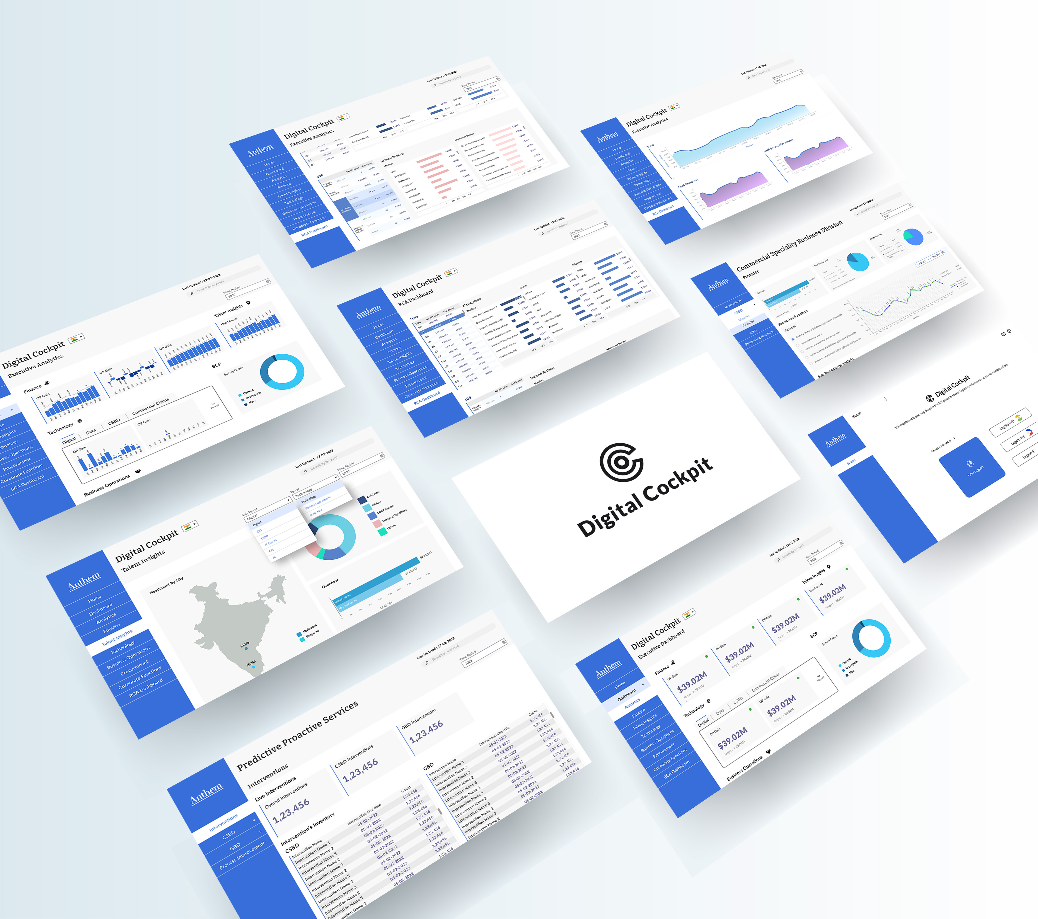
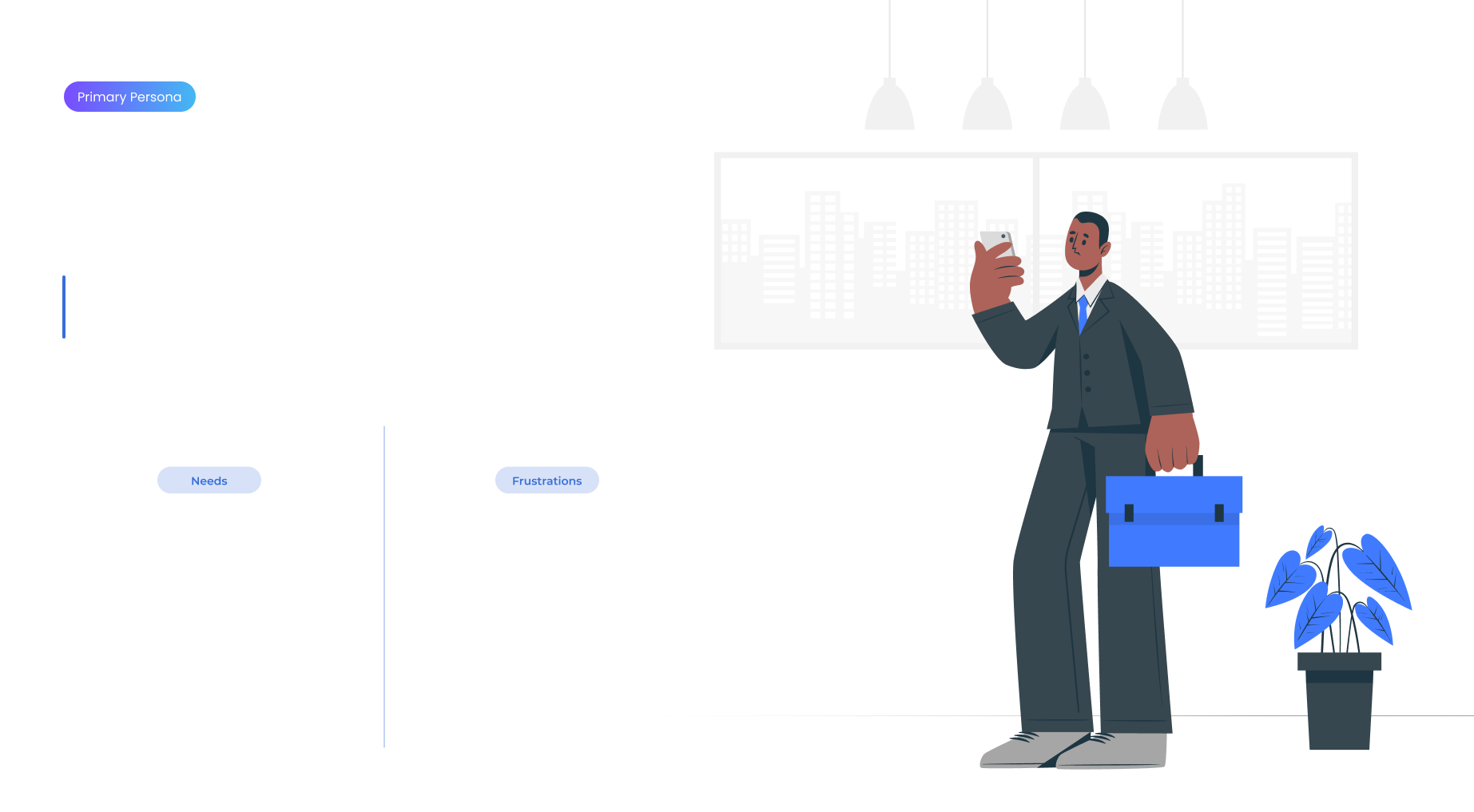
Digital Cockpit is a web based information hub for all organisational data. Designed for the senior leadership of Anthem Healthcare to access data with ease and make decisions efficiently and effectively. Digital Cockpit is built on Tableau, which enables its users to share data, prioritise data as well as align data with desired business outcomes.
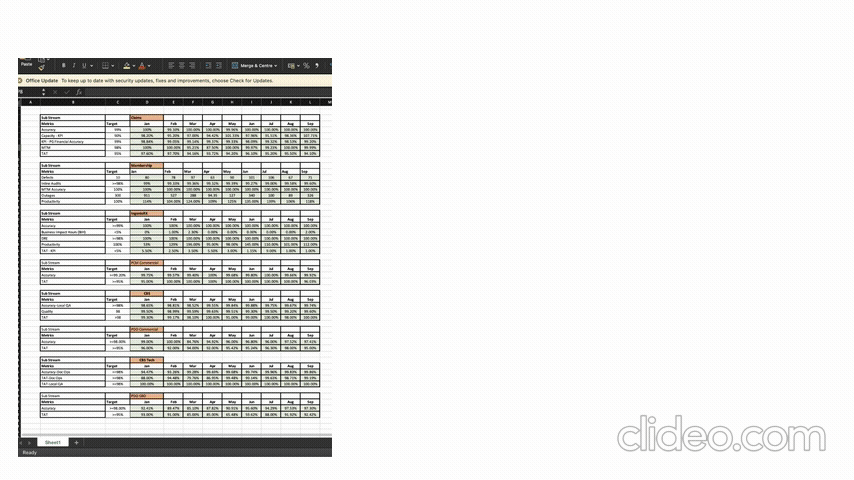
Before Digital Cockpit, all data was stored in protected excel documents which was not only precarious, but also caused information overload for any viewer. Excessive lines and columns of metrics were difficult to navigate, increasing time taken to make decisions and digital fatigue. The objective of digital cockpit essentially, was to make the lives of decision makers easier when dealing with loads of data.
.png)
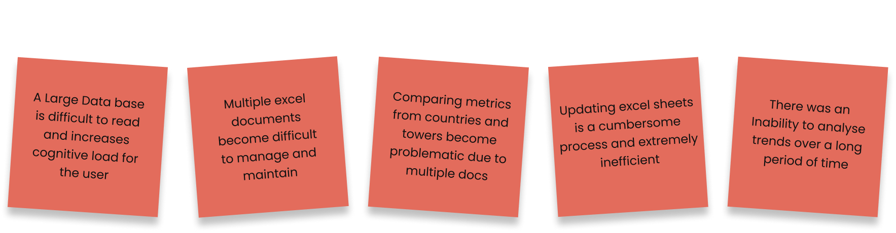
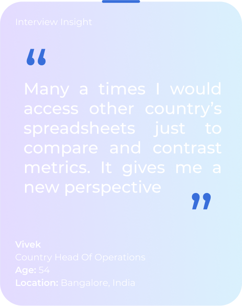
Navigating through numerous Excel spreadsheets and diving into levels of information to locate the metric that they want to see was cumbersome and inefficient. Moreover, Vivek had to manually check the data for each month of the year to understand the trend of the metric.
To work with such vast and complex data, it was important to get organised. A simple process of immersion and analysis using tools like data flow charts and thematic analysis came in handy to make sense of the data. Through our group brainstorming sessions, we were able to break down the data into three major themes (levels of information):
.png)
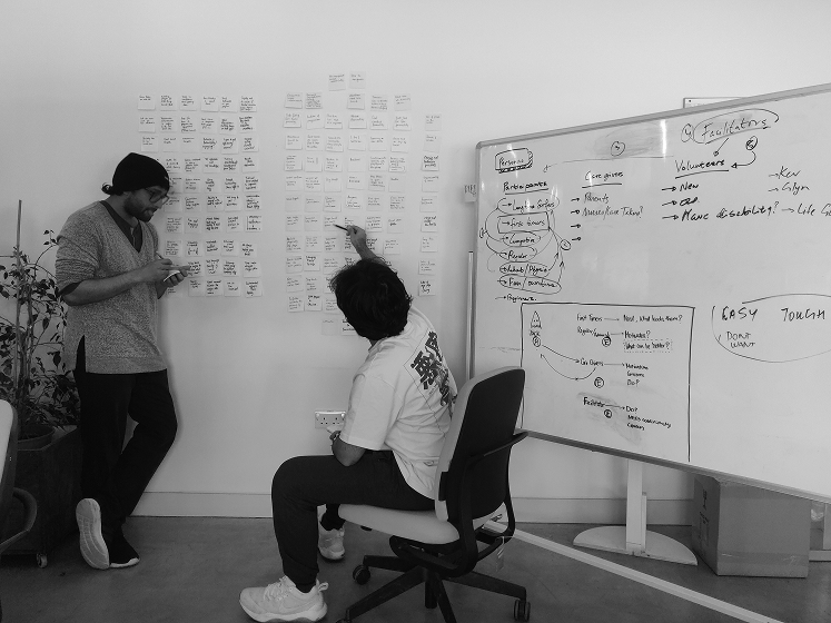
Engaging in an agile workflow, our regular meet-ups with product owners proved invaluable in deciphering the technical nuances of information and gaining a deep understanding of the user journey. Collaborative efforts and sprint-based exercises like card sorting and thematic analysis allowed our team to synchronise, fostering real-time idea sharing. Within our cross-functional team, diverse perspectives emerged, enriching our decision-making process. We were able make sense of the information and understand the hierarchy of content.
We conducted 2 card sorting workshops with 9 participants, including designers, product owners and potential users. We asked users to sort cards in two different ways:
%201.jpg)
.png)
Through thoughtful discussions, we collectively crafted an information architecture centered around a user-friendly dashboard. This dashboard serves as a consolidated hub, presenting crucial data from all segments at a glance, thereby saving valuable user time. Additionally, it acts as a gateway for users to delve deeper into specific segments if desired. Our user flow design prioritises efficiency and simplicity, thoughtfully catering to the user's needs. It's a result of collaborative efforts and a commitment to creating a seamless experience for our users.
.png)
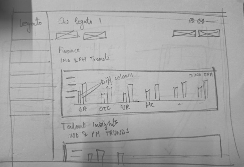
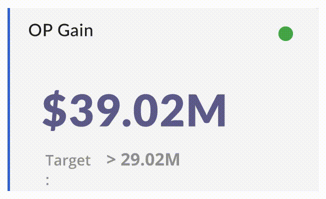
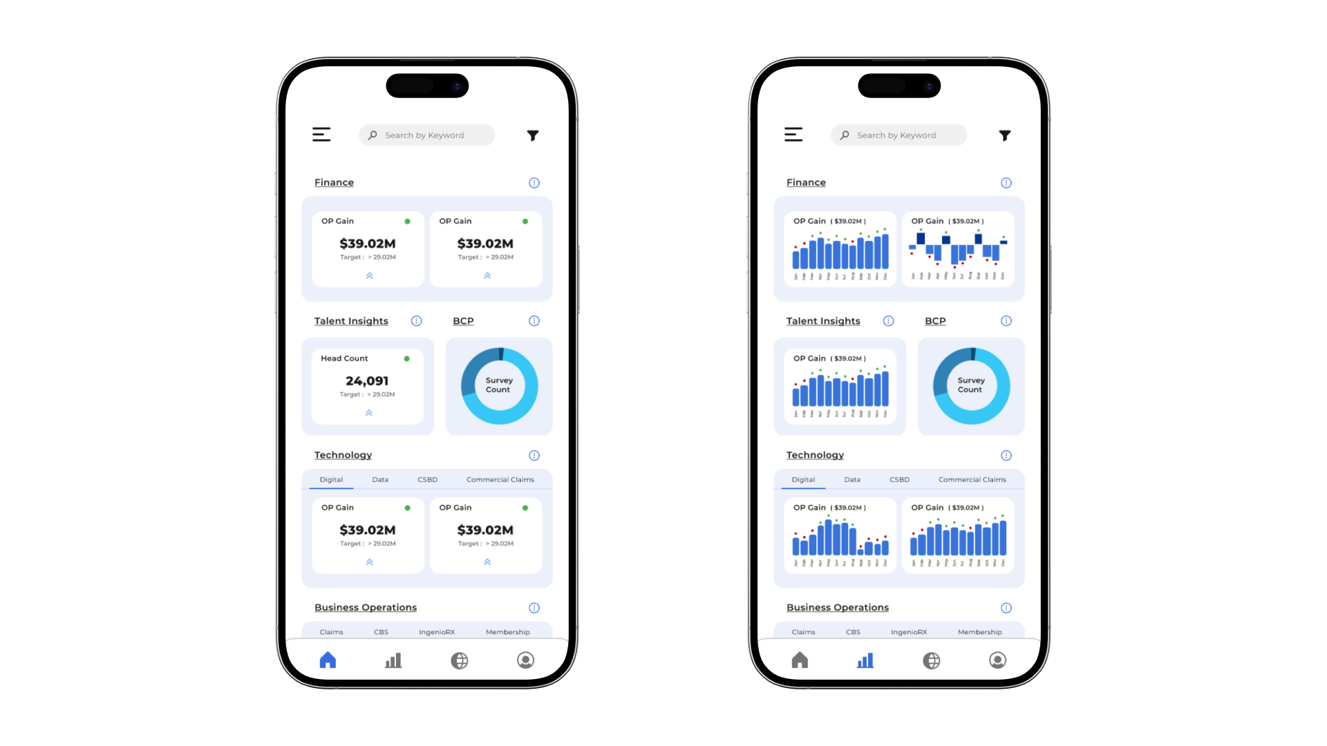
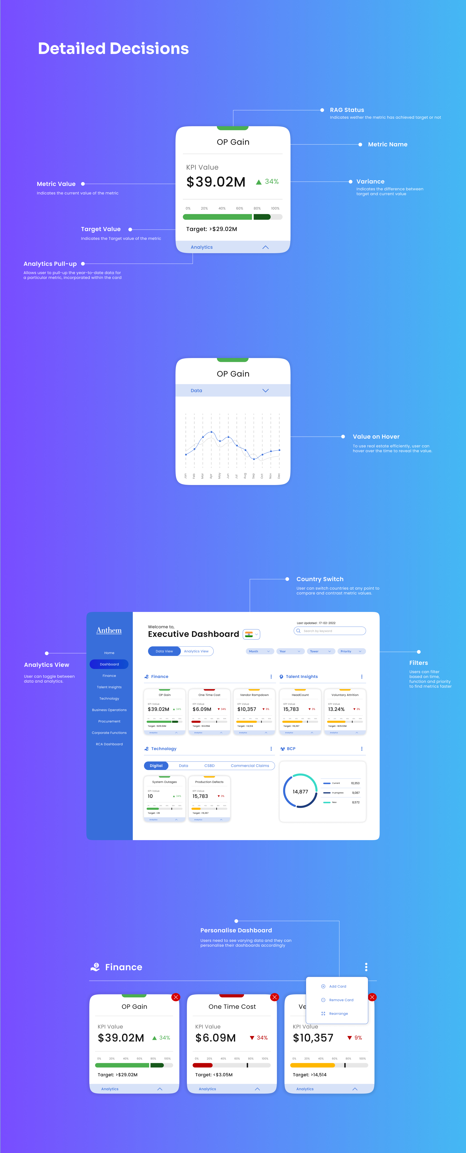
Once we had the application's backbone in place, our mission was to transform individual metrics into visually appealing data representations. Each metric packed a punch with key elements like metric value, target, and RAG Status (did it meet the target or not?). Our challenge was to cleverly weave all these details into a single UI component, ensuring that the metric's current status could be effortlessly grasped. Cue the brainstorming sessions and wild idea generation, including the quirky yet effective "crazy 8's." The result? A sleek card design emeged from our iterative sketches. We then threw our concept to the development team for a feasibility check, and lo and behold, it got the golden stamp of approval. We're now on track to bring a visually cohesive and user-friendly metric display to life!
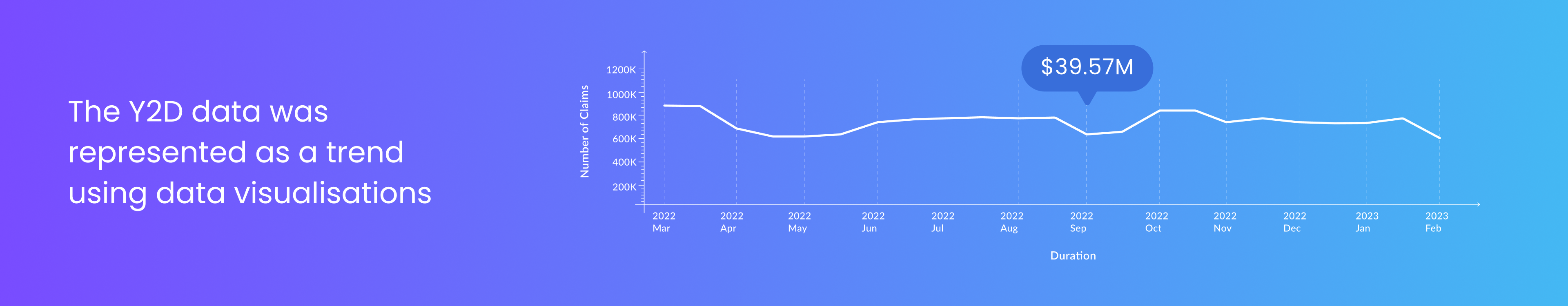
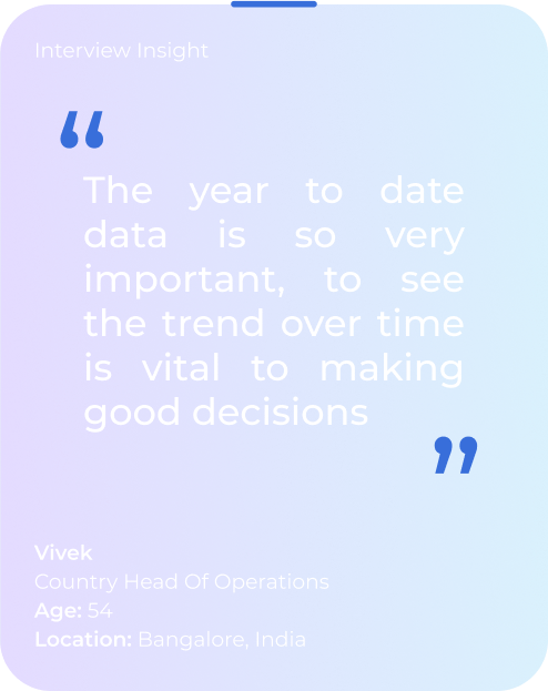
While the existing data held significance, the year-to-date data was equally pivotal, offering insights into the metric value's fluctuation over time. Classifying the data types enabled us to ideate and craft six distinct representations that effectively conveyed the trends. These visual representations are illustrated in the image below for reference.
.png)
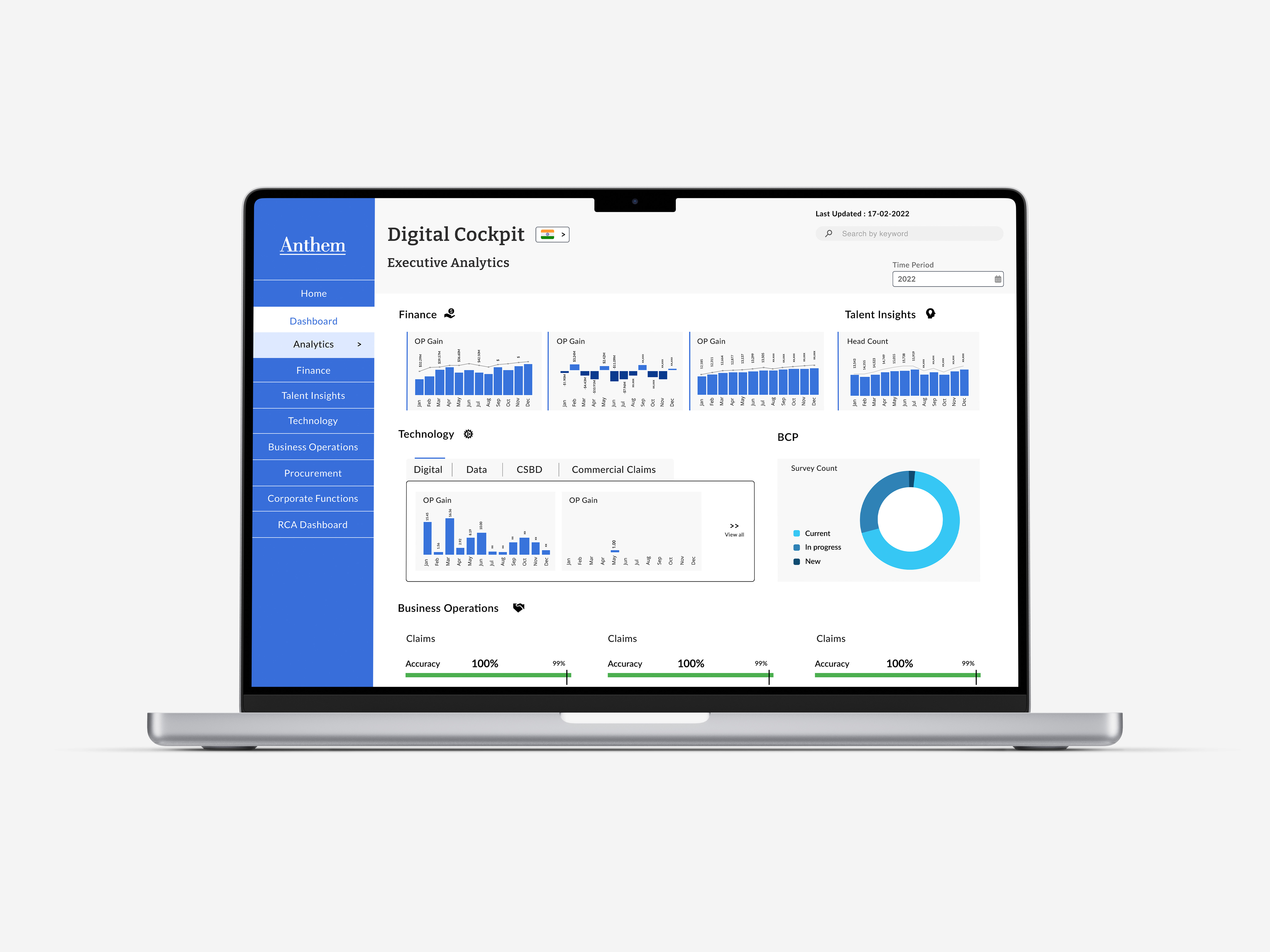
Picture the Dashboard as the heart of our application, packed with the most crucial and frequently accessed information across all segments. Our goal? To make sure users get what they need without plunging deep into different areas for everyday info. Now, what should this must-see data be? That's where the fun brainstorming sessions with product owners and senior leadership came in. We had a bunch of meetings, picking their brains to understand what truly matters to them. With that golden nugget of information, we sorted out some top-notch metrics from each segment and seamlessly planted them on the dashboard.

When it came to crafting the dashboard's UI, we got hands-on with creativity. Multiple wireframes and paper prototypes were drafted to figure out the perfect spot for each component, ensuring we made the most of our digital real estate. We threw in a nifty navigation bar on the left for easy hopping between segments and the dashboard. Oh, and not to forget the filters – we added those bad boys for some fine-tuning based on time, tower, RAG Status, and more. It's all about making things sleek, user-friendly, and efficient!
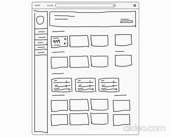
Through iterative development, we designed the high fidelity prototype of the dashboard, the heart of the application, housing the go-to KPI's for quick viewing.
While we initially crafted distinct pages for current metrics and year-to-date metrics, a key insight gleaned from user and product owner interviews prompted a strategic adjustment for a more seamless user experience. Recognising a common user behaviour—wherein users frequently transition from viewing current data to year-to-date data—we seized the opportunity to integrate both seamlessly.
To achieve this integration, we engaged in the prototyping of multiple card iterations, carefully considering user interactions. Empowering users with the ability to access Year-to-Date (Y2D) data for individual metrics and enabling a comprehensive view of the entire Y2D dataset was a deliberate choice. This approach aimed to streamline the user experience by reducing cognitive load, minimising the number of steps, and consequently, mitigating user effort.

The initial concept prioritised vertically expanding the card to unveil Year-to-Date (Y2D) data. While effective in achieving the intended objective, its implementation on the page, particularly alongside multiple other cards, presented a challenge. The vertical expansion encroached upon real estate that could be occupied by other cards when expanded.
The subsequent prototype adopted a metaphorical approach, treating the card as a physical entity with two sides. Upon hovering, the current metric seamlessly transitioned to unveil the Year-to-Date (Y2D) data on the opposite side. This design not only conserved valuable real estate but also successfully met our objective. Consequently, this iteration was selected as our preferred card design.
Recognizing the users' frequent need to access data for different countries while navigating through a single country's information, we introduced a country switch interaction located at the top of each page. This design feature allows users to seamlessly transition between countries, facilitating a fluid and uninterrupted exploration of data across various geographical regions. The implementation of this interaction has proven particularly beneficial, enhancing the overall usability of the application.

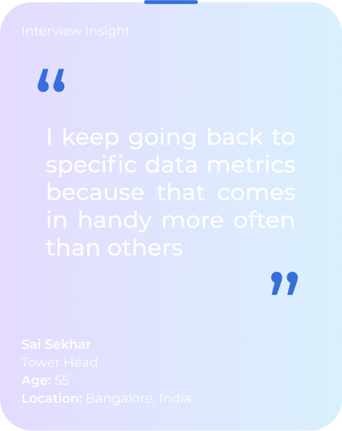
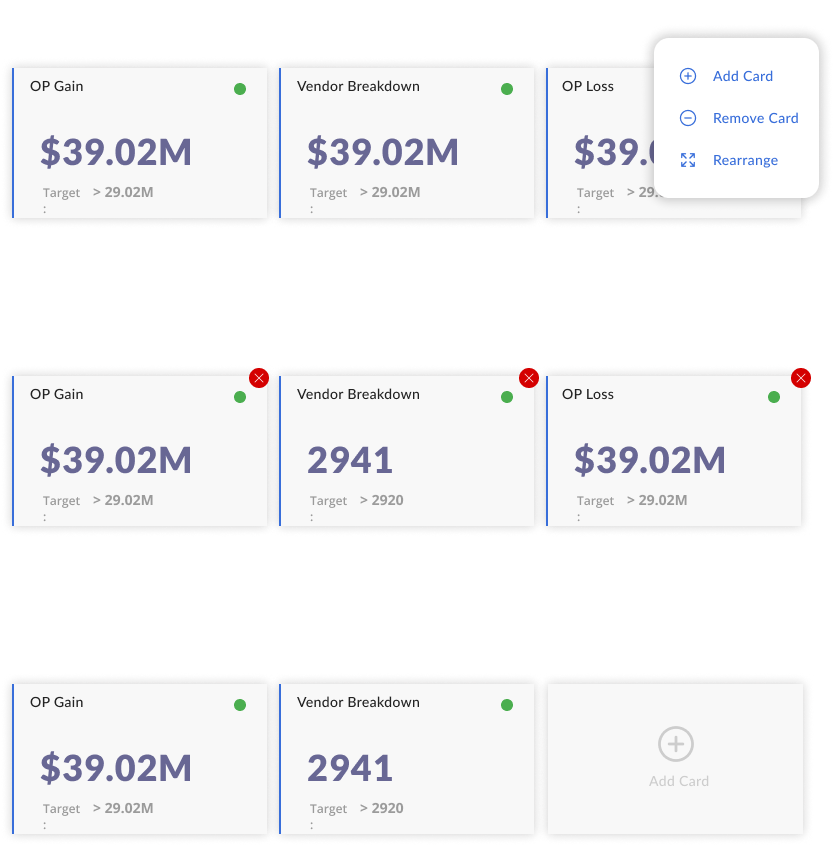
Giving the users the ability to Personalise their Dashboard gave them freedom to choose metrics which suited them. Easy access to the metric they use everyday reduced their load further and enhanced the experience greatly.
As a nuanced enhancement to the Year-to-Date (Y2D) data visualisation, we incorporated subtle loading animations. This deliberate addition serves as an enriching element to the overall user experience, introducing metrics sequentially with a refined animation. This not only contributes to the aesthetic appeal but also effectively conveys the unfolding trends within the data, elevating the product's overall user engagement.
We designed the product for a specific user group but made sure it is accessible on all browsers and responsive across devices. Additionally, we adhered to WCAG Guidelines in the content design, visual design, and development phases, maintaining AAA standards.


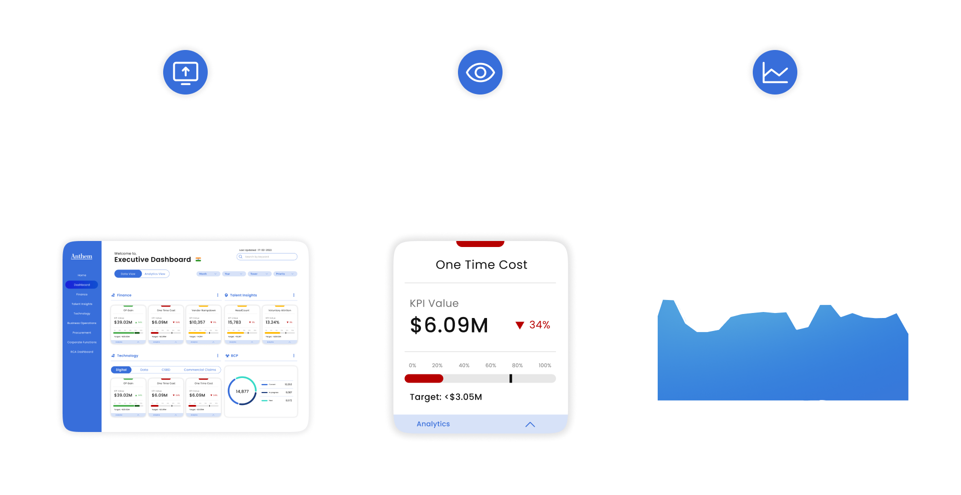
Working closely with developers, we designed a mobile application for Digital Cockpit for on-the-go analysis and better accessibility from phones. Most leadership are often travelling and the possibility of viewing data on the go improves their efficiency multiple folds.
.png)
To implement these accessibility features in the visual design of the product, we designed a style guide which maintained consistency across the product during the development phase and also served as a document for the development team to refer to.
.png)
Within five months, we were able to build and deliver digital cockpit from scratch. The application was developed using a document that was handed over to the development team, which included all details (basically a style guide) for all components of the UI. I was awarded a recognition for my pivotal role in the product delivery. Currently being used my 2K+ leadership members in Legato Health Technologies across India, Philippines and Ireland.