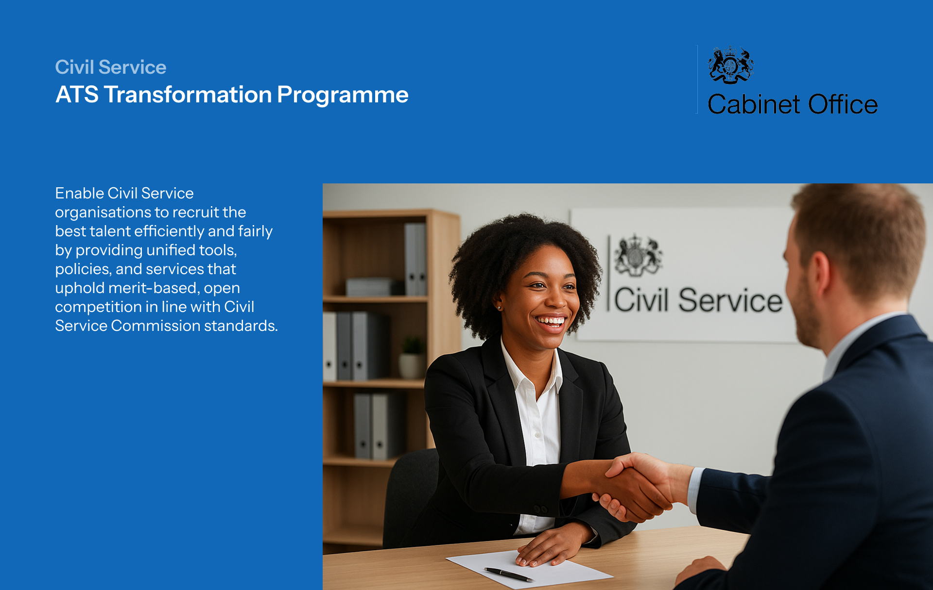
Bow Hospitality Group proudly oversees a collection of eight distinctive venues, ranging from upscale steakhouses to lively karaoke bars. With such a diverse portfolio, it's essential to convey a blend of warmth, professionalism, and a commitment to service above all else. That's precisely why I was entrusted with the task of revitalising their online visual identity—the website—aiming to solidify Bow Hospitality's position as one of Scotland's foremost hospitality groups.
My intention with this audit was to identify the good, bad and ugly and improve the existing product on all fronts.


Working in an agile manner, I set the expectations of the client with a structured project plan with timelines, milestones and deliverables. The design plan considered stakeholder meetings, design sprints as well as peer reviews from time to time.

The business owner was unavailable for a month and hence, I had no clarity of what their vision for the product was. All I was given was the fact that they loved the website for The Shard London. I studied the website and tried to understand what made it appealing.

With this information, I conducted a heuristic evaluation of the existing site and tested it for navigation, task completion, aesthetics, UX law violations and error handling. I rated my findings from 0-5 in terms of usability (0 being no issues) and derived insights to inform the new user flow and information architecture.


With most emphasis on imagery, I knew it is vital for decision making. Moreover, I considered more aspects of information which can make decision making faster and give the user more trust and confidence. So what content really mattered?
The redesign gave priority to the fact that user should have all the information to make an informed decision. But, does all information need to be given at the same time? This card would go down to be challenged and iterated during further stages of prototyping.
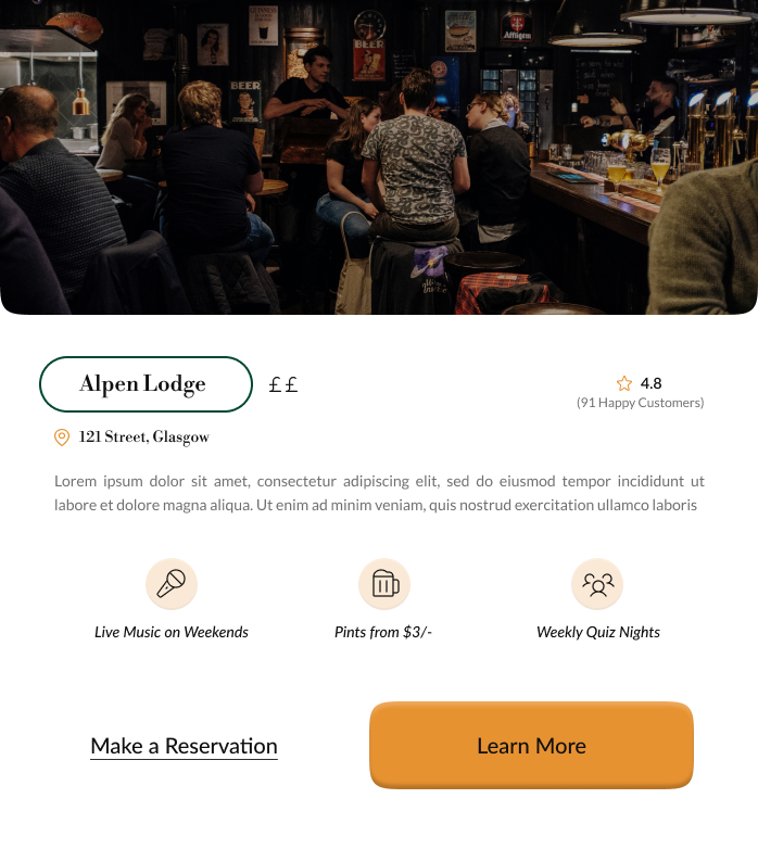
This cards became the first UI components to be implemented in the prototype. The prototype was built in three stages: a paper prototype with hand drawn wireframes, a medium fidelity prototype and a high fidelity interactive prototype. After building the medium fidelity prototype, I conducted role play sessions with the team members to test and gather feedback.

Iterating on testing feedback, I designed a new card and interaction, designed a new careers page and revamped the components (buttons, filters, tabs etc) to reflect an edgy and professional brand.

I built a complete interactive prototype on Figma for an authentic experience during testing and presentation. The research and prototype was presented to the client and they loved what I had done with audit. However, they were not a big fan of the visual identity and wanted to stick closer to the initial colours. Hence, I designed an alternative with the original colours and positioned the website to have a light and dark theme. This improved accessibility as well as helped the business achieve their vision.


During the 2 month tenure of my contract, I conducted market research, competitor analysis and user research to uncover key insights which informed the redesign. I conducted heuristic evaluation and developed a new visual identity. I prototyped across multiple fidelities and incorporated feedback at each iteration to develop a complete high fidelity interactive Figma prototype. For a smooth transition towards the development phase, I built a handover document with component library, style guides, spacings and assets.
The product is currently in development, being developed on Elementor Wordpress.